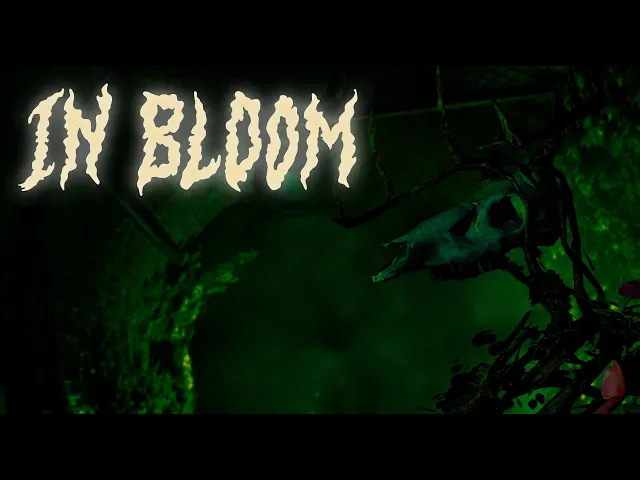


In Bloom is a First-Person Horror Action game that was developed as part of Future Games curriculum program called Game Project #3. A collaboration between Future Games Sweden North and Future Games Poland Warzaw.

School
Project
School
Project
15 People
7 Weeks
Figma, Unreal,
Perforce
UX/UI
Designer
In Bloom is a student project that was made during Future Games course "Game Project #3" as part of the curriculum.
This project really highlighted the importance of communication for me when working in a multidisciplinary team. And the challenges it can give when those expectations are tested and in worst case, not met.
Introduction


producT
overview
In Bloom is a survival-horror game developed under the school’s "green environment" theme. Unlike most games where lush nature signals safety, we inverted this expectation, creating a world where vibrant flora is sentient, hostile, and consuming life into a hivemind.
Built in first-person with realistic graphics, the game delivers an eerie atmosphere while emphasizing dread and vulnerability. Limited ammunition reinforces tension, requiring players to carefully consider each encounter, echoing the resource scarcity central to survival-horror.

In Bloom is a First-Person Horror Action game that was developed as part of Future Games curriculum program called Game Project #3. A collaboration between Future Games Sweden North and Future Games Poland Warzaw.

UX/UI
Designer
School
Project
Figma, Unreal
Engine, Perforce
7 Weeks
15 People
Introduction
In Bloom is a student project that was made during Future Games course "Game Project #3" as part of the curriculum.
This project really highlighted the importance of communication for me when working in a multidisciplinary team. And the challenges it can give when those expectations are tested and in worst case, not met.

Picture showing an example of how the information and insights were
gathered and organized.
UI/HUD - Minimal and clean, showing information only when necessary and aligned with the game’s atmosphere.
Prompts - Clear, consistent prompts to guide players with key items and functions.
Feedback - Impactful responses to player actions, with the gun designed to feel both rewarding and vital as the sole means of defense.
Visual Cues – Use leading lines and vistas to guide players toward goals, and distinguish pick-ups with clear visual hints.
Audio Cues – Rely on sound to set the mood and use spatial 3D audio to direct players to key functions.
Atmosphere – Emphasize audio for greater impact in horror, while journals and radio dialogues subtly expand the story and enhance the uncanny tone.
The concluded information and recommendations were presented to the rest of the team in a shortened “must-read” format that everyone should take part of and read, while the full, more heavy documentation was also shared for those who wanted a more in-depth understanding.
When looking at our pitch and concept combined with the results and insights from the competitor evaluation, our target audience was clear. Who we are designing for and what type of users we strive for to be our primary type of players, and the target audience was something we and I always had in mind when designing and working further on in this project.

the design
process
menu:
The first thing I designed was the game’s menus, focusing on a minimalistic style to reinforce the survival horror mood. Starting with user flows and competitor research, I sketched, wireframed, and tested different layouts before finalizing the design. I chose left-aligned menu options for consistency and to highlight the atmospheric background.

The final design featured smooth transitions, text-based buttons with hover effects, and clear readability adjustments. I implemented these designs in Unreal Engine using Widget Blueprints, while collaborating with a programmer for functionality. Other menus such as pause, options, and game over followed the same principles.


Final design that's in-game:
AMMO COUNTER:
Most of the design and the functions regarding the ammo counter is backed and based on the previous competitor evaluation where key points and insights were extracted. Sticking to one of our core principles of never causing any unnecessary confusion for the player, having the ammo counter follow a familiar standard that is more than often seen in this genre proved to help the player in handling the game as expected.
Match the inventory minimalistic style
Color changed by high/low ammo as a visual aid
Expected standard placement in the genre
Fading in & out when necessary for the player
Easier to remember ammo count due to being dynamic

INVENTORY:
The whole inventory section was something that was never originally planned for initially but had to be designed and implemented due to development taking a different direction. Since development and backlog were growing, we had to shift our focus to immediate solutions that would keep the intended experience intact. Having some leeway with our own established visual and functional identity, I was able to come up with some solutions that would make the Inventory Slot fit in. The challenges it came with and the solutions we opted for is as follows:
Challenges:
Confusion with what they wanted to display and how
Not interactive
No time to test
Solutions:
Iterations made after game designers needs
Fades in and out with the ammo counter
Curated to the maximum items at the same time

Due to dissagreements, the inventory system were close to be a catalyst for a bad user experience, That would result in having no inventory screen or information regarding key-items.
Leaving the player to remember all by themselves. This was a big No from a UX perspective, I heavily pushed iterations to the team in how to display and give the information for the player regarding key-items. Lifting up the positive impact it would have for the user experience.
PROMPT:
The pick-up prompts in the game went through several iterations, with different kinds of shapes and indications, but all of them aligning into the same identity. Final result ending up into a merge of the different variations. This look is not only visaully appealing but also a clear indication on what can be interacted with and where said event is in the world space. On pick-ups, the prompt is also accompanied with a light glow to highlight it’s presence.
This part of the work was more than just a handover since me and my UX Colleague deemed it to be crucial for the overall presentation for the game and we took it upon ourselves to implement it so that we could easily adjust every little detail in how and when it’s presented to the player. Where just one small intricate misalignment could bring down the overall experience, we wanted full control of it’s presentation.

DAMAGE VIGNETTE:
The damage vignette idea came alive as soon as we pitched our concept of the world where vibrant flora is sentient, hostile, and consuming life itself. The idea was to have flora or branches slowly growing into the screen from the sides when the player took damage, instead of the regular blood vignette you often see in horror games.
The vignette had some iterations to go through to find a design that aligned with our games visual identity.

The designs where first done in Canva to get a feeling ot how it would work, then later made in unreal engine with assets we used in the game.
One wish was to make it “grow” in to the screen, but due to our teams different levels of experience and the time that we got on this project, we had to settle with the vignette as a fade in by damage instance the player took instead, acting as a compromise to get the vignette to function.
USER TESTING
We had the opportunity to conduct a proper user-testing of our game in between the alpha and beta sprint. At that moment it gave us the chance to test out the functions, understandability and formed out hypothesises at a more raw prototype stage which gave us a fair window for us to take the time afterwards to work with iterations and improvements. The users were curated to fit our target audience.
METHOD:
I used the silent observer method, observed the user and taking notes on how they navigated the game and everything they did and say while playing.
Observations.
Interview questions after the test session.
The goal I set up for the users were clear and simple, go through start to finish from what is available, from point A to point B. I as observer set up some hypotheses that I wanted to test and see how the users handled the game and it’s certain aspects, if it would validate or challenge our design. Some of the more meaningful hypotheses are:
Hypotheses:
The games sections are easy to navigate, and the player doesn’t get lost, giving the player a good flow and sense of direction.
The amount of ammo available to the player is good and reasonable, not giving too much so they feel overpowered.
The pacing of the game feels right and no sections drag on for too long so that the player doesn’t feel bored.
INTERVIEWS &
QUOTES:
I did prepare with some set interview questions to ask the testers afterwards, while also leaving room for spontaneous questions regarding interesting observings that caught our attention during the session. What follows are some examples of the interview questions and quotes that left a meaningful impact with us:
How did YOU feel about the information presented to you, and what kind of emotions did that invoke?
"The ending puzzle felt very unclear and not logical at all. I was just lucky that I cleared the game.”
“The interactions and pick-ups itselves needs to give more of an impact and more feedback to the player.”
“Why is everything that I should do colored in red? The locks, the key, and the shootable locks. Red means danger, not progression.”
What did you think of the tension and atmosphere. did you get the feeling that you were playing a survival horror game?
“I got the feeling that I’m in a place I don’t belong in and I didn’t feel welcomed, which is good for a horror game.”
“Give the enemy an intro where they are running towards the player, which would build up the scary atmosphere.”
“Really liked the design of the Main Menu, which was aligned with survival horror."
How did you feel navigating through the sections of the game?
“This game feels like a walking sim from time to time, and it’s having an identity crisis if it's supposed to be a survival horror, action game or a walking simulator.”
Our usertesting session yielded us a lot of valuable data and insights, all ranging from plain information presented to the player such as Menus and feedback to the level design and enemies in itself. Every user gave us not only correlated data that matched between each user but also each one of them gave us unique insights and valuable information from observing them and from the interviews.

Granted, this gave us a lot of information that needed to be indexed and categorised so that we could actually work with the data that we got. How I did that was to break down the data into sections and then find correlations between each section. From there I could easily categorize and name each section, not only making my work easier but also making the future handover and presentation for the rest of the team easily digested and understandable.
With all the relevant data condensed and categorized, we could easily spot the most critical parts of the game that needed to be improved so that we could deliver the best possible experience for our players. And those parts could be named into five topics:
ENEMIES
UNDERSTANDING
AREA SIZES
GUN MECHANIC
NAVIGATION
product overview
In Bloom is a survival-horror game developed under the school’s "green environment" theme. Unlike most games where lush nature signals safety, we inverted this expectation, creating a world where vibrant flora is sentient, hostile, and consuming life into a hivemind.
Built in first-person with realistic graphics, the game delivers an eerie atmosphere while emphasizing dread and vulnerability. Limited ammunition reinforces tension, requiring players to carefully consider each encounter, echoing the resource scarcity central to survival-horror.
Goals
The goal of In Bloom was to create an atmospheric and uncanny horror experience that fit the school’s environment theme. By lulling players into a false sense of security, like a venus flytrap, the game aims to unsettle and challenge conventional associations between beauty and safety in game environments.
One of the goals was also to capture that old-school survival horror feeling like the old Resident Evil games, where every action, every shot with your gun, had to be reconsidered and evaluated. Risk vs reward principle.
researching the market
As of in my role as UX/UI Designer, before starting any design related work I wanted to research the survival horror type of games a bit deeper. Working closely with my UX colleague, we started to look into what other available games are out there that are aligned with our concept and our key features that we could use in our competitor evaluation. The competitor evaluation was a great start to this project and the data and takeaways we got from it laid a solid foundation for us to work from.
Ended up evaluating three different games, the target was five for more diverse information but due to time constraints the minimum target of three was at least met. The games that met our concept was Resident Evil VII, Maid of Skeer, and Doom 3. All of them focusing on immersing the player in a haunting yet intriguing atmosphere while also delivering a satisfying usage of firearms. An equal amount of time was spent on playing and analyzing them, and valuable insights that were of particular importance such as:
UI/HUD - Minimal and clean, showing information only when necessary and aligned with the game’s atmosphere.
Prompts - Clear, consistent prompts to guide players with key items and functions.
Feedback - Impactful responses to player actions, with the gun designed to feel both rewarding and vital as the sole means of defense.
Visual Cues – Use leading lines and vistas to guide players toward goals, and distinguish pick-ups with clear visual hints.
Audio Cues – Rely on sound to set the mood and use spatial 3D audio to direct players to key functions.
Atmosphere – Emphasize audio for greater impact in horror, while journals and radio dialogues subtly expand the story and enhance the uncanny tone.
Picture showing an example of how the information and insights were gathered and organized.
The concluded information and recommendations were presented to the rest of the team in a shortened “must-read” format that everyone should take part of and read, while the full, more heavy documentation was also shared for those who wanted a more in-depth understanding.
When looking at our pitch and concept combined with the results and insights from the competitor evaluation, our target audience was clear. Who we are designing for and what type of users we strive for to be our primary type of players, and the target audience was something we and I always had in mind when designing and working further on in this project.
the design process
menu:
The first thing I designed was the game’s menus, focusing on a minimalistic style to reinforce the survival horror mood. Starting with user flows and competitor research, I sketched, wireframed, and tested different layouts before finalizing the design. I chose left-aligned menu options for consistency and to highlight the atmospheric background.
The final design featured smooth transitions, text-based buttons with hover effects, and clear readability adjustments. I implemented these designs in Unreal Engine using Widget Blueprints, while collaborating with a programmer for functionality. Other menus such as pause, options, and game over followed the same principles.
AMMO COUNTER:
Most of the design and the functions regarding the ammo counter is backed and based on the previous competitor evaluation where key points and insights were extracted. Sticking to one of our core principles of never causing any unnecessary confusion for the player, having the ammo counter follow a familiar standard that is more than often seen in this genre proved to help the player in handling the game as expected.
Match the inventory minimalistic style
Color changed by high/low ammo as a visual aid
Expected standard placement in the genre
Fading in & out when necessary for the player
Easier to remember ammo count due to being dynamic
INVENTORY:
The whole inventory section was something that was never originally planned for initially but had to be designed and implemented due to development taking a different direction. Since development and backlog were growing, we had to shift our focus to immediate solutions that would keep the intended experience intact. Having some leeway with our own established visual and functional identity, I was able to come up with some solutions that would make the Inventory Slot fit in. The challenges it came with and the solutions we opted for is as follows:
Challenges:
Confusion with what they wanted to display and how
Not interactive
No time to test
Solutions:
Iterations made after game designers needs
Fades in and out with the ammo counter
Curated to the maximum items at the same time
Due to dissagreements, the inventory system were close to be a catalyst for a bad user experience, That would result in having no inventory screen or information regarding key-items.
Leaving the player to remember all by themselves. This was a big No from a UX perspective, I heavily pushed iterations to the team in how to display and give the information for the player regarding key-items. Lifting up the positive impact it would have for the user experience.
PROMPT:
The pick-up prompts in the game went through several iterations, with different kinds of shapes and indications, but all of them aligning into the same identity. Final result ending up into a merge of the different variations. This look is not only visaully appealing but also a clear indication on what can be interacted with and where said event is in the world space. On pick-ups, the prompt is also accompanied with a light glow to highlight it’s presence.
This part of the work was more than just a handover since me and my UX Colleague deemed it to be crucial for the overall presentation for the game and we took it upon ourselves to implement it so that we could easily adjust every little detail in how and when it’s presented to the player. Where just one small intricate misalignment could bring down the overall experience, we wanted full control of it’s presentation.
DAMAGE VIGNETTE:
The damage vignette idea came alive as soon as we pitched our concept of the world where vibrant flora is sentient, hostile, and consuming life itself. The idea was to have flora or branches slowly growing into the screen from the sides when the player took damage, instead of the regular blood vignette you often see in horror games.
The vignette had some iterations to go through to find a design that aligned with our games visual identity.
The designs were first done in Canva to get a feeling ot how it would work, then later made in unreal engine with assets we used in the game.
One wish was to make it “grow” in to the screen, but due to our teams different levels of experience and the amount of time we had on this project, we had to settle with the vignette as a fade in by damage instance the player took instead, acting as a compromise to get the vignette to function.
USER TESTING
We had the opportunity to conduct a proper user-testing of our game in between the alpha and beta sprint. At that moment it gave us the chance to test out the functions, understandability and formed out hypothesises at a more raw prototype stage which gave us a fair window for us to take the time afterwards to work with iterations and improvements. The users were curated to fit our target audience.
METHOD:
I used the silent observer method, observed the user and taking notes on how they navigated the game and everything they did and say while playing.
Observations.
Interview questions after the test session.
The goal I set up for the users were clear and simple, go through start to finish from what is available, from point A to point B. I as observer set up some hypotheses that I wanted to test and see how the users handled the game and it’s certain aspects, if it would validate or challenge our design. Some of the more meaningful hypotheses are:
Hypotheses:
The games sections are easy to navigate, and the player doesn’t get lost, giving the player a good flow and sense of direction.
The amount of ammo available to the player is good and reasonable, not giving too much so they feel overpowered.
The pacing of the game feels right and no sections drag on for too long so that the player doesn’t feel bored.
INTERVIEWS & QUOTES:
I did prepare with some set interview questions to ask the testers afterwards, while also leaving room for spontaneous questions regarding interesting observings that caught our attention during the session. What follows are some examples of the interview questions and quotes that left a meaningful impact with us:
How did YOU feel about the information presented to you, and what kind of emotions did that invoke?
"The ending puzzle felt very unclear and not logical at all. I was just lucky that I cleared the game.”
“The interactions and pick-ups itselves needs to give more of an impact and more feedback to the player.”
“Why is everything that I should do colored in red? The locks, the key, and the shootable locks. Red means danger, not progression.”
What did you think of the tension and atmosphere. did you get the feeling that you were playing a survival horror game?
“I got the feeling that I’m in a place I don’t belong in and I didn’t feel welcomed, which is good for a horror game.”
“Give the enemy an intro where they are running towards the player, which would build up the scary atmosphere.”
“Really liked the design of the Main Menu, which was aligned with survival horror."
How did you feel navigating through the sections of the game?
“This game feels like a walking sim from time to time, and it’s having an identity crisis if it's supposed to be a survival horror, action game or a walking simulator.”
Our usertesting session yielded us a lot of valuable data and insights, all ranging from plain information presented to the player such as Menus and feedback to the level design and enemies in itself. Every user gave us not only correlated data that matched between each user but also each one of them gave us unique insights and valuable information from observing them and from the interviews.
Granted, this gave us a lot of information that needed to be indexed and categorised so that we could actually work with the data that we got. How I did that was to break down the data into sections and then find correlations between each section. From there I could easily categorize and name each section, not only making my work easier but also making the future handover and presentation for the rest of the team easily digested and understandable.
With all the relevant data condensed and categorized, we could easily spot the most critical parts of the game that needed to be improved so that we could deliver the best possible experience for our players. And those parts could be named into five topics:
NAVIGATION
GUN MECHANIC
ENEMIES
AREA SIZES
UNDERSTANDING
The best approach for us to deliver this information to our team was to present it in a shortened down, condensed format, highlighting the most impactful and valuable information. While also providing the full, in-depth document for those who wanted to go deeper into our work.
The best approach for us to deliver this information to our team was to present it in a shortened down, condensed format, highlighting the most impactful and valuable information. While also providing the full, in-depth document for those who wanted to go deeper into our work.


Example: Two slides from the condensed presentationt the team. Each topic no more than one slide.
PROBLEMS &
CHALLENGES
Throughout the project we in UX division faced several challenges, many of which we had anticipated early on. To prevent potential setbacks, we actively discussed possible issues in advance and aligned on solutions as soon as possible.


IGNORED GDD


UX DiMINISHMENT
MEDDLING WITHOUT CONSENT
NOT SHARING VITAL
INFO AND DECISIONS
MISUNDERSTANDING OF
CONCEPT
USER DATA NEGLIGENCE
NOT ANSWERING QUESTIONS
One key learning to us was the importance of “killing your darlings”, not becoming emotionally attached to ones ideas or concepts. Due to gaps in communication within the team, we on the UX side had to remain extremely flexible and be ready to shift focus at any moment.
Unfortunately, some of the problems we had previously highlighted were overlooked by the team and eventually escalated, impacting the project at a critical stage.
This situation often forced us to rely on our own intuition, since user research and data were not always respected by the team. Despite this, we on the UX side continued to base our design decisions on the validated user insights relevant to our work and stayed committed to advocating for the user throughout the process.
Even though the project was turbulent, our vision remained clear: to deliver the most user-centric experience possible, rooted in the needs of our target audience.
CONCLUSION &
LEARNINGS
As a final conclusion, I can say that not every project is a smooth ride and it can most certainly be a bumpy ride to say the least. But keeping to your core principles, which in this case was to focus in on the best possible user experience and how to deliver that to the players, will help you to get through turbulent and hectic times. A game project can also very quickly go in another direction than it was intended, and that do happen in the industry, but when it goes completely off-tracks, be ready to voice your concerns and do have underlying data to help back your opinions, since that will help in convincing others and help them understand your point.
Key learnings from this project that I will carry with me in the future:
COMMUNICATION &
CLARITY
Communication is key.
Set expectations and share yours.
Overexplain rather than underexplain.
Explain your role to the team.
Store, share and update all the information in one place: GDD.
Flexibility & BE
READY FOR
ANYTHING
Be able to shift focus quickly.
“Kill your darlings”
No emotional attachments.
Be ready for the concept to change.
Thank you for reading my project breakdown and my process within "In Bloom" project. A short little Survival Horror experience.
Link to:


Example: Two slides from the condensed presentation to the team. Each topic no more than one slide.
CHALLENGES
Throughout the project we in UX division faced several challenges, many of which we had anticipated early on. To prevent potential setbacks, we actively discussed possible issues in advance and aligned on solutions as soon as possible.
IGNORED GDD
MEDDLING WITHOUT CONSENT
NOT SHARING VITAL INFO AND DECISIONS
MISUNDERSTANDING OF CONCEPT
USER DATA NEGLIGENCE
NOT ANSWERING QUESTIONS
UX DiMINISHMENT
One key learning to us was the importance of “killing your darlings”, not becoming emotionally attached to ones ideas or concepts. Due to gaps in communication within the team, we had to remain extremely flexible and be ready to shift focus at any moment.
Unfortunately, some of the problems we on the UX side had previously highlighted were overlooked by the team and eventually escalated, impacting the project at a critical stage.
This situation often forced us to rely on our own intuition, since user research and data were not always respected by the team. Despite this, we continued to base our design decisions on the validated user insights relevant to our work and stayed committed to advocating for the user throughout the process.
Even though the project was turbulent, our vision remained clear: to deliver the most user-centric experience possible, rooted in the needs of our target audience.
CONCLUSION & LEARNINGS
As a final conclusion, I can say that not every project is a smooth ride and it can most certainly be a bumpy ride to say the least. But keeping to your core principles, which in this case was to focus in on the best possible user experience and how to deliver that to the players, will help you to get through turbulent and hectic times. A game project can also very quickly go in another direction than it was intended, and that do happen in the industry, but when it goes completely off-tracks, be ready to voice your concerns and do have underlying data to help back your opinions, since that will help in convincing others and help them understand your point and get them on board.
Key learnings from this project that I will carry with me in the future:
COMMUNICATION & CLARITY
Communication is key.
Set expectations and share yours.
Overexplain rather than underexplain.
Explain your role to the team.
Store, share and update all the information in one place: GDD.
Flexibility & BE READY FOR ANYTHING
Be able to shift focus quickly.
“Kill your darlings”.
No emotional attachments.
Be ready for the concept to change.
Thank you for reading my project breakdown and my process within "In Bloom" project. A short little Survival Horror experience.
Link to:


Goals
The goal of In Bloom was to create an atmospheric and uncanny horror experience that fit the school’s environment theme. By lulling players into a false sense of security, like a venus flytrap, the game aims to unsettle and challenge conventional associations between beauty and safety in game environments.
One of the goals was also to capture that old-school survival horror feeling like the old Resident Evil games, where every action, every shot with your gun, had to be reconsidered and evaluated. Risk vs reward principle.
researching
the market
As of in my role as UX/UI Designer, before starting any design related work I wanted to research the survival horror type of games a bit deeper. Working closely with my UX colleague, we started to look into what other available games are out there that are aligned with our concept and our key features that we could use in our competitor evaluation. The competitor evaluation was a great start to this project and the data and takeaways we got from it laid a solid foundation for us to work from.
Ended up evaluating three different games, the target was five for more diverse information but due to time constraints the minimum target of three was at least met. The games that met our concept was Resident Evil VII, Maid of Skeer, and Doom 3. All of them focusing on immersing the player in a haunting yet intriguing atmosphere while also delivering a satisfying usage of firearms. An equal amount of time was spent on playing and analyzing them, and valuable insights that were of particular importance such as: